
Top 3 Colour Trends in Corporate Uniforms and Workwear
In the world of professional attire, your choice of workwear colours acts as a silent ambassador for your brand. It is the first thing a client notices, often before a single word is exchanged. Research indicates that 46% of online customers find a brand’s colour scheme important when they’re making a purchase, making your uniform palette a critical component of your corporate identity.
At Buytshirtsonline, we’ve seen a shift from basic functionality to strategic styling. The colours you choose must not only look professional but also serve as a high-contrast canvas for your business logo. Whether you are opting for the classic Fruit of the Loom Original T or a more formal polo, the interaction between the garment shade and your embroidery or print design is what defines a truly polished look.
TL;DR
Choosing the right workwear colours is a strategic business decision that impacts brand trust, employee productivity, and customer perception. In 2026, the dominant trends are Sophisticated Blues (for authority), Earthy Neutrals (for sustainability and comfort), and Optimistic Accents (for approachability). Aligning these trends with high-quality embroidery ensures your team looks professional while staying on-brand.
Content
- The "Trust & Tech" Palette: Deep Sophisticated Blues
- "Earthy Resilience": Grounding Neutral Tones
- "Optimistic Accents": High-Energy Pops of Colour
- Making the Final Decision for Your Logo
- Dressing for Hybrid Success
- The Shift in Corporate Colour Psychology
- Frequently Asked Questions (FAQs)
- Custom Workwear at Buytshirtsonline
The “Trust & Tech” Palette: Deep Sophisticated Blues
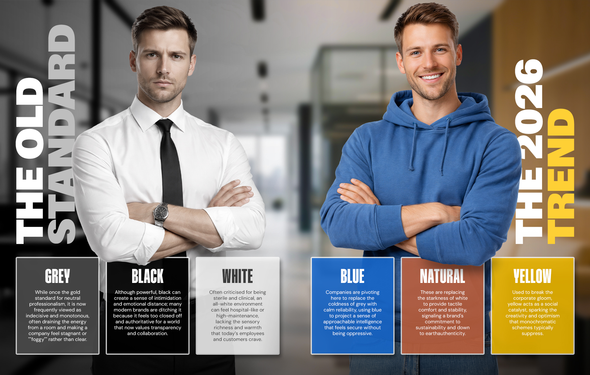
Blue has long been a staple in corporate environments, but the 2026 trend moves away from standard royal blue toward deeper, more “moody” tones, such as Future Dusk.
- The Trend: Sophisticated, dark navy and midnight blues are replacing harsh blacks to provide a look that is authoritative yet accessible.
- The Data: Blue remains the #1 colour for building brand trust, cited by 34% of consumers. It’s no coincidence that approximately 40% of Fortune 500 companies use blue in their branding.
- Psychological Impact: According to a 2019 study by Microsoft Japan, blue colours were reported to help with stress management and focus, increasing office productivity by up to 40%.
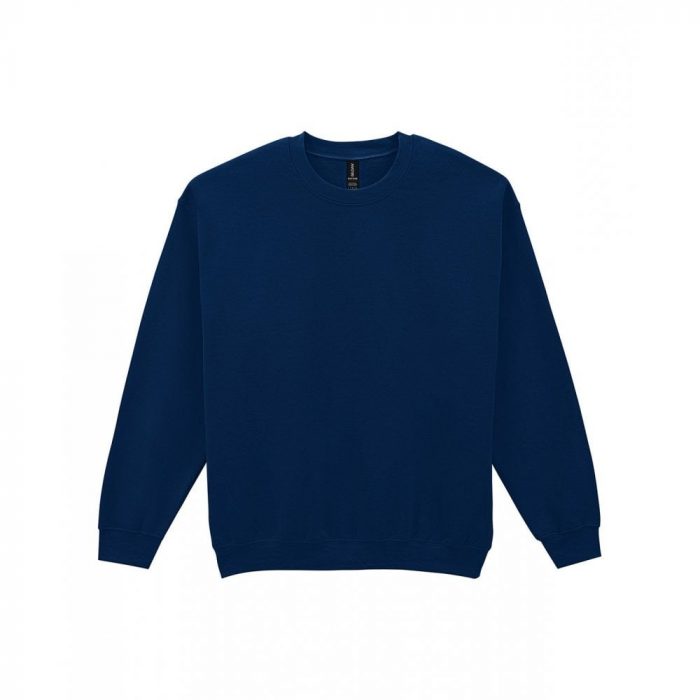
Expert Tip: For a modern tech or corporate office look, consider the Gildan Heavy Blend Crew Neck Sweatshirt in Navy or Royal. It provides a professional silhouette while maintaining all-day comfort.
“Earthy Resilience”: Grounding Neutral Tones
As businesses lean further into sustainability and Environmental, Social, and Governance (ESG) goals, workwear colours are reflecting this shift through “grounding” neutrals.
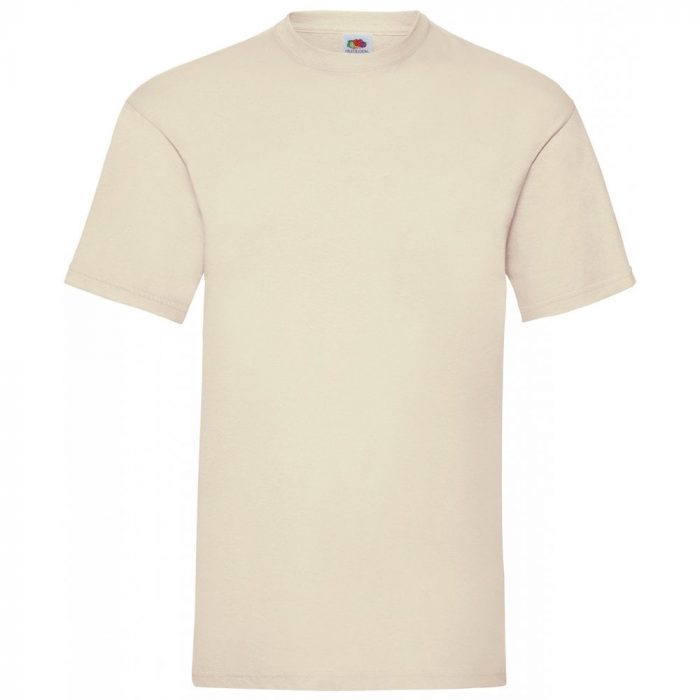
- The Trend: Warm browns, oatmeal, and sage green are replacing the sterile “office greys” of the last decade.
- The Data: Data from Heuritech shows that “Hues of Brown” saw a 24% rise in interest recently, signalling consumer interest in authenticity.
- The Sustainability Connection: These colours are used to communicate a brand’s commitment to the environment visually, a top-three priority for B2B procurement in 2026.
“Optimistic Accents”: High-Energy Pops of Colour
While the base of a uniform often remains neutral for versatility, 2026 is seeing the rise of Optimistic Accents, using high-energy colours to boost morale and brand recall.
- The Trend: Using a neutral base (like black or charcoal) paired with a “pop” of yellow, electric cobalt, or vibrant orange in accessories, trims, or logo embroidery.
- The “Happiness” Factor: Yellow is psychologically linked to self-assurance and optimism. In hospitality or retail, a splash of yellow can make service teams appear more approachable and energetic.
- Brand Recall: Consistent use of a bold accent colour can boost brand recognition by up to 80%.
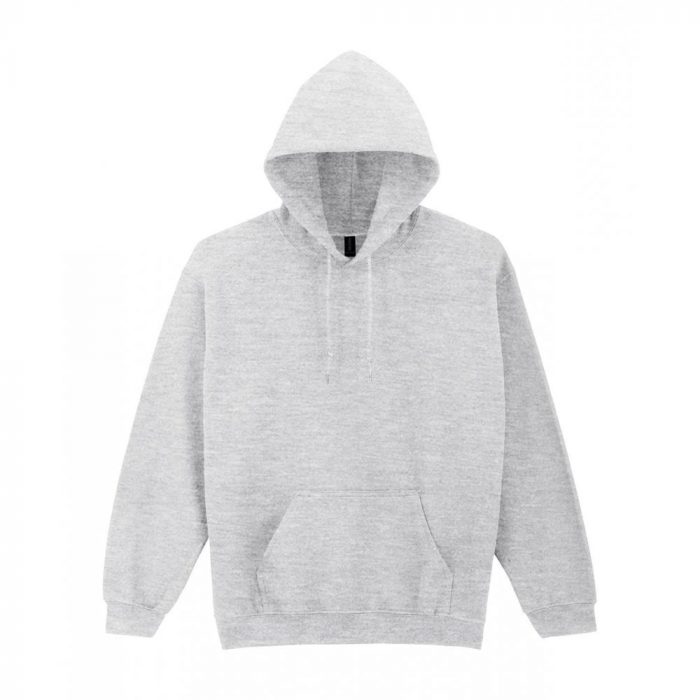
Recommended Product: Pair a neutral Gildan Heavy Blend Sweatshirt with a vibrant embroidered logo to achieve this high-impact, professional look.
Making the Final Decision for Your Logo
| If your goal is | Use this trend | For this business benefit |
|---|---|---|
| Boosting Consumer Trust | Trust & Tech (Navy & Dark Blues) | Stabilises brand perception during market volatility. |
| Reducing Staff Stress | Earthy Resilience (Sage, Stone) | Lowers workplace cortisol; supports employee mental health. |
| Maximising Staff Visibility | Optimistic Accents (Cobalt & Butter Yellow) | Makes staff instantly “findable” in busy retail/logistics hubs. |
Choosing the right workwear colours is only half the battle; the second half is ensuring your logo stands out.
- Contrast is King: If you choose a dark “Trust & Tech” blue, ensure your logo uses lighter threads or inks (white, silver, or pale yellow).
- Complementary Tones: Earthy neutrals work beautifully with tonal embroidery, think a dark forest-green logo on a sage-green base.
- Consistency: Ensure the colours chosen align with your digital branding to create a seamless customer experience from screen to storefront.
We stock a massive range of garments in these trending palettes from world-class brands like Gildan and Fruit of the Loom. For more help, check out The Ultimate Guide to Workwear.
Dressing for Hybrid Success
As the boundaries between home and office continue to blur in 2026, the “Hybrid Uniform” has emerged as the gold standard for the modern workforce. We are no longer just dressing for the person across the desk; we are dressing for the person on the other end of the Zoom call.
The trend has shifted toward “Power Comfort”: garments that look sharp on a 4K webcam but feel like loungewear. Think high-quality Gildan Softstyle T-Shirts layered under structured knitwear.
Why Hybrid Uniforms Matter:
- Brand Equity: Even when working from a coffee shop, a subtle left-chest embroidery maintains a professional “front.”
- Employee Equity: Providing a hybrid kit ensures remote staff feel just as much a part of the team as those in the 6,000 sq ft unit.
- The “Video-First” Aesthetic: We recommend mid-tone teals and warm greys, as these don’t “wash out” under home office LED lighting or cause “strobing” on camera as fine stripes do.
Expert Tip: For the ultimate hybrid piece, our customers are loving the Fruit of the Loom Premium Sweats. They offer a polished, matte finish that looks like a high-end sweater on screen but provides the warmth needed for a home office.

The Shift in Corporate Colour Psychology
In the early 2000s, corporate colours were often chosen based on what hid stains the best. Today, the shift in corporate colour psychology is driven by a need for emotional intelligence and neuromarketing.
The “Corporate Shift” we are seeing isn’t just about fashion; it’s about how the brain processes environmental stress. As global markets become more volatile, brands are using colour to provide a “sensory anchor” for their clients and staff.
How Psychology Has Changed the Corporate World:
- From Aggression to Empathy: The “Power Red” ties of the 90s have been replaced by Sage Greens and Earthy Stone. These colours trigger the release of oxytocin, fostering a sense of safety and collaboration.
- The “Future Dusk” Phenomenon: Dark, “moody” blues are being used to signal high-tech capability and mystery, moving away from the “friendly” but somewhat dated bright Royal Blue.
- The Productivity Link: By moving away from sterile white and stark black, companies are seeing fewer instances of “Visual Fatigue” among employees, leading to higher retention and fewer errors.
The interaction between your chosen garment colour and your logo isn’t just a design choice; it’s a psychological strategy. A navy blue Gildan hoodie with a silver embroidered logo doesn’t just say “Staff”; it says “Stability, Tech, and Quality.”
Frequently Asked Questions (FAQs)
What are the most professional workwear colours for 2026?
The most professional colours currently trending are deep navies (Future Dusk), charcoal greys, and earthy neutrals like sage and warm brown. These offer a modern alternative to traditional black.
How does colour affect employee productivity?
Colours like blue and green are scientifically linked to increased focus and job satisfaction. Blue can increase productivity by up to 40%, while green is associated with lower stress levels.
Should I choose different colours for different departments?
Yes, many companies use “colour coding.” For example, management may wear sophisticated navy blue, while customer-facing roles may wear “optimistic” accents like yellow or bright blue to appear more approachable. For more on this, see our guide on choosing the right workwear.
What colours should I avoid in a professional setting?
Avoid overly neon or “fluorescent” colours unless required for Hi-Vis safety. Extremely bright colours can be distracting in an office environment. They may negatively affect the colour perception of your brand’s colours.

Custom Workwear at Buytshirtsonline
Selecting your workwear colours is a powerful branding tool that influences how the world perceives your business. By moving toward sophisticated blues, grounding neutrals, or strategic optimistic accents, you position your brand as forward-thinking and trustworthy.
Ready to upgrade your team’s look? Explore our full range of workwear from top brands today. Whether you need high-volume screen printing or intricate embroidery, our in-house team is ready to bring your brand to life.
Read next
How to Choose the Best T-Shirts for Printing On
How to Design a T-Shirt
The Ultimate Guide to Workwear
Comments are closed here.